Scale, Warp Speed and Charts
Posted: Thu Jul 16, 2009 7:10 pm
I was puttering about with the PD warp speed charts trying to reverse engineer the formula to add values for other warp speeds and noticed something.
Our galaxy (the SFU one) is 100,000 light years across. That's about 30,656 parsecs (at 3.262 ly / pc) or about 61 F&E hexes (each 500 pc). That would make the circumference of our galaxy to be 192.62 hexes long.
http://starfleetgames.com/galaxy_map_Color.pdf
Now, the galaxy is divided into 24 pie slice sectors. Each sector would therefore by about 8 hexes across along the circumference. However, the map of the galaxy in the PD book shows the Alpha Octant map (taken from F&E if I'm not mistaken) taking three sectors yet the map itself is 61 hexes wide. The F&E map should actually cover almost 8 sectors just by itself. Add in the Omega map (64 hexes across) and half a sector for the void and ISC, and the total size of those two maps will account for 16 sectors, almost 2/3 of the entire galaxy! That's not suprising considering the F&E map is a long as the galaxy.
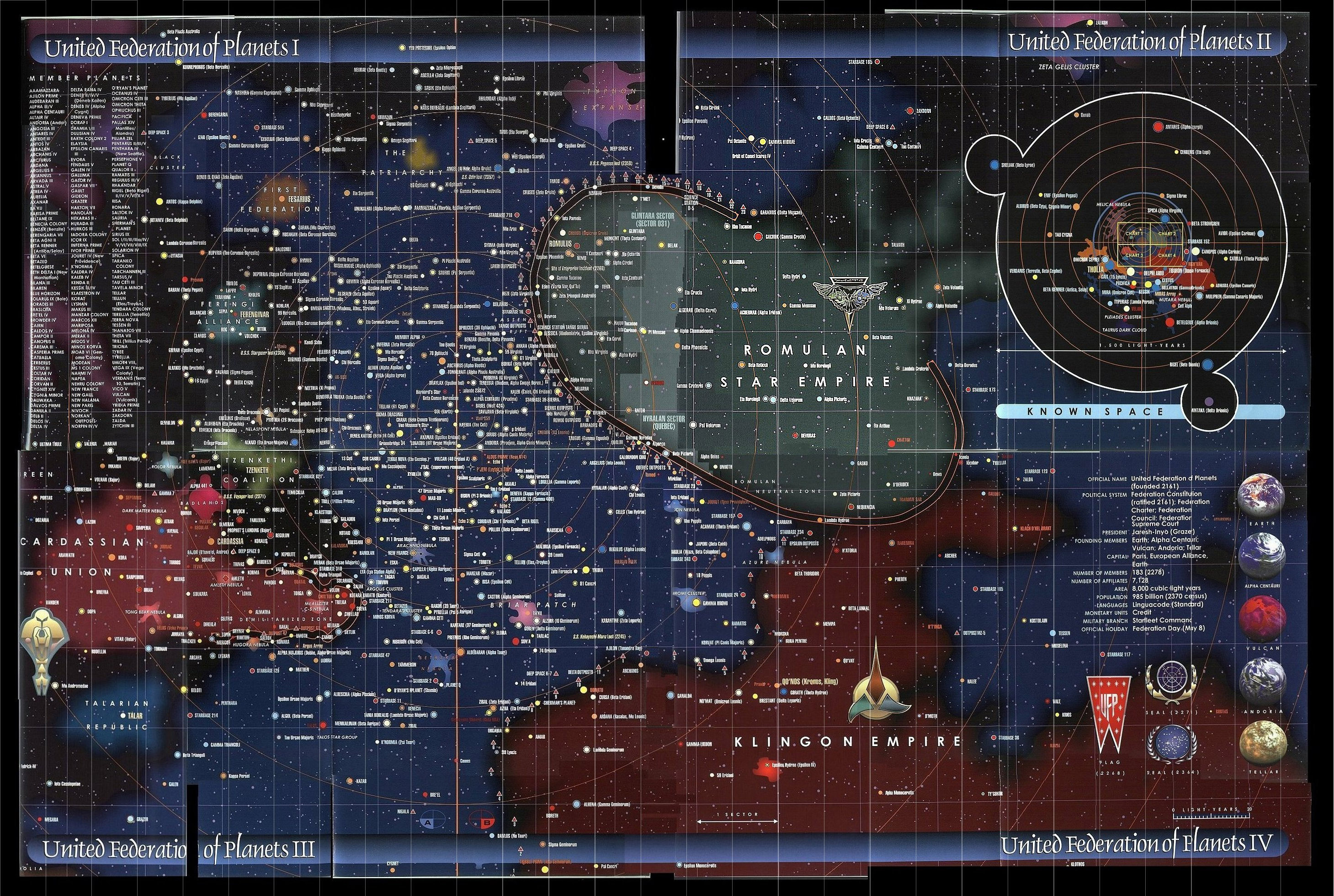
Is my math wrong? I have no real problem with the F&E map taking up 1/4 of the galaxy but it is pretty easy to fix by saying each F&E hex is only 200 parsecs across and dividing all the movement rates by 2.5. I have, OTOH, seen "maps" of Star Trek that show the Federation as much smaller. This one:
http://www.civfanatics.net/uploads9/Star_trek_map2.jpg
while pretty, shows the entire ST world fitting inside what F&E takes for just the Federation. The Romulan Empire would fit inside two F&E hexes. The F&E map does, however, exactly match the size of the Federation in the Star Fleet Technical Manual.
On a related topic, I have an old game Web & Starship. While not a great game, it has a cool map that is an accurate representation of stars around the earth complete with adjustments for each star relative to the galactic plane.
http://www.boardgamegeek.com/image/17808
I've tried to look for star charts but they inevitably end up showing the stars location as angles from Earth's viewpoint. Not too useful when plotting a map. Does anyone know where I can get a chart more like a map?
Aaron
Our galaxy (the SFU one) is 100,000 light years across. That's about 30,656 parsecs (at 3.262 ly / pc) or about 61 F&E hexes (each 500 pc). That would make the circumference of our galaxy to be 192.62 hexes long.
http://starfleetgames.com/galaxy_map_Color.pdf
Now, the galaxy is divided into 24 pie slice sectors. Each sector would therefore by about 8 hexes across along the circumference. However, the map of the galaxy in the PD book shows the Alpha Octant map (taken from F&E if I'm not mistaken) taking three sectors yet the map itself is 61 hexes wide. The F&E map should actually cover almost 8 sectors just by itself. Add in the Omega map (64 hexes across) and half a sector for the void and ISC, and the total size of those two maps will account for 16 sectors, almost 2/3 of the entire galaxy! That's not suprising considering the F&E map is a long as the galaxy.
Is my math wrong? I have no real problem with the F&E map taking up 1/4 of the galaxy but it is pretty easy to fix by saying each F&E hex is only 200 parsecs across and dividing all the movement rates by 2.5. I have, OTOH, seen "maps" of Star Trek that show the Federation as much smaller. This one:
http://www.civfanatics.net/uploads9/Star_trek_map2.jpg
while pretty, shows the entire ST world fitting inside what F&E takes for just the Federation. The Romulan Empire would fit inside two F&E hexes. The F&E map does, however, exactly match the size of the Federation in the Star Fleet Technical Manual.
On a related topic, I have an old game Web & Starship. While not a great game, it has a cool map that is an accurate representation of stars around the earth complete with adjustments for each star relative to the galactic plane.
http://www.boardgamegeek.com/image/17808
I've tried to look for star charts but they inevitably end up showing the stars location as angles from Earth's viewpoint. Not too useful when plotting a map. Does anyone know where I can get a chart more like a map?
Aaron