| By Steve Cole (Stevecole) on Wednesday, September 12, 2007 - 10:50 am: Edit |
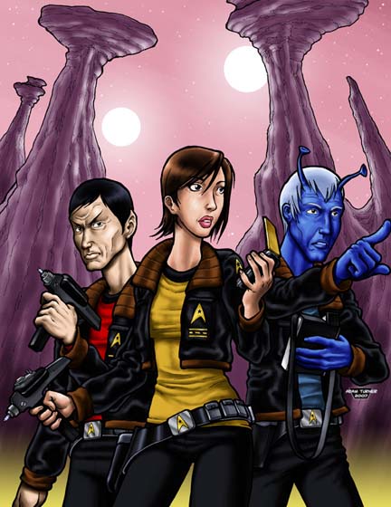
Cover for PD20 Feds
| By Will McCammon (Djdood) on Wednesday, September 12, 2007 - 01:01 pm: Edit |
Nice. A different look than before, but I like Adam's style.
The way he draws the ladies are always hubba-hubba. She has a touch of a Sarah-Michelle Geller in her face, which is not a bad thing at all.
I like how it is dead-obvious that this is "classic Trek", but yet, it ain't - it's SFU. The jackets and belt-buckles are really nice extrapolations.
| By John Sickels (Johnsickels) on Wednesday, September 12, 2007 - 05:27 pm: Edit |
have to say that I don't really like it. Looks cartoony. I prefer more realism, but that's just my taste....it is well-done an artistic, but not my style.
| By Steve Cole (Stevecole) on Wednesday, September 12, 2007 - 05:43 pm: Edit |
I like it, and Aldo (who runs GAMEBUYER, the second biggest magazine in the industry, and gives free advertising but ONLY if he likes the cover) is giving us a free ad for the first time EVER, he likes it so much.
| By Loren Knight (Loren) on Wednesday, September 12, 2007 - 05:49 pm: Edit |
There is a lot of things I like about it and some I don't. The highlights and color and detail is excelent. For the style it's really very nicely done. I have to agree with John though in that it looks very cartoony and I think that some might not take the product seriously. There is a very noticable trend in game covers that those with cartoony cover art are silly fun while those with more realistic styles (like the PD20 Klingons cover) are more serious and hard core (and since it's a game it's fun). I ownder if players will get the impression that this is a serious Trek style game. I think they will be surprised to find what they will find inside (which is a lot of serious and interesting data).
What lends to the cartoony look is the large head and hands. I think the phaser handls are a bit long. A little more sharp texture int he rocks behind might have improved things.
What I do like... well all of it as an individual piece. The clothing textures, the two dim suns (or are they bright moons), the clothing designs are excellent, and I totally dig the "pretty but real" woman (as opposed to uber model vixen chick that prevails in fantacy art).
| By Loren Knight (Loren) on Wednesday, September 12, 2007 - 05:50 pm: Edit |
Can't beat it when it scores you a free ad.
| By F. Douglas Wall (Knarf) on Wednesday, September 12, 2007 - 05:57 pm: Edit |
Any hope that this image will find it's way onto the cover of the GURPS book? It's a very fun image
| By Dale McKee (Brigman) on Wednesday, September 12, 2007 - 06:30 pm: Edit |
I give this one three snaps in a circular formation!
I know SJ Games doesn't like "colored line art" but I love it, and I think it's very evocative of a lot of the modern graphic-novel style art out there. It looks hip, modern, and fun.
| By Steve Cole (Stevecole) on Wednesday, September 12, 2007 - 06:43 pm: Edit |
Jackson has already approved other art for the GURPS version. we might use this for interior art.
| By Loren Knight (Loren) on Wednesday, September 12, 2007 - 06:50 pm: Edit |
Heh, I thought this was your art Dale but I just noticed the sig.: Adam Turner.
| By Steve Cole (Stevecole) on Wednesday, September 12, 2007 - 07:02 pm: Edit |
Adam has been wanting to do people and I said I'd let him try.
| By Will McCammon (Djdood) on Wednesday, September 12, 2007 - 08:05 pm: Edit |
If you've never seen Adam's comic/graphic novel, you should check it out. Same style. Interesting characters.
| By Gary Plana (Garyplana) on Wednesday, September 12, 2007 - 10:07 pm: Edit |
SVC: if this is the Aldo Ghozzi that I remember, who was the inspiration for the entire Ferengi race, then I guess it's a pretty good cover. 
It's still pretty good, though. Different, but not too non-Paramounty.
I'll remind you to post the GPD-FED cover when you get back.
| By michael john campbell (Michaelcampbell) on Thursday, September 13, 2007 - 01:17 am: Edit |
Having recently watched the entire star trek animated series...I like this cover because it reminds me of that and just how phonomial it was. The Jackets are like a cross between THE CAGE and the WRATH OF KHAN which is totally groovy.
The "Han Solo blaster belt" thing is a bit too out of the norm for trek and the fact that the girl is wearing a bolero jacket whereas the guys are both wearing bomber jackets; misses trek's attachment to equal oppertunity (try Rewatching The Cage)...but I can't do better so I'm gunna say that it's thoroughly cool.
| By Steve Cole (Stevecole) on Thursday, September 13, 2007 - 11:08 am: Edit |
Bolero Jacket? Bomber Jacket? Is this Project Runway?
| By Robert Gilson (Bobcat) on Thursday, September 13, 2007 - 11:44 am: Edit |
I like it. Will it be available for the mugs and things store?
| By Michael Powers (Mtpowers) on Thursday, September 13, 2007 - 12:19 pm: Edit |
Hm. I like it, too, but these woman does look like she just beamed down from the Battlestar Treklactica. I kind of agree with mjc; the "Wild West" style of belt doesn't fit the Trek theme; which is disciplined (although not necessarily militaristic.) And why must the woman's outfit be different from the men's outfits? Obviously they're built differently and accomodations need to be made for that, but is there something special about the woman's butt that requires less insulation? (I suppose you could argue that there's insulation built-in. OH SNAP)
| By michael john campbell (Michaelcampbell) on Thursday, September 13, 2007 - 11:51 pm: Edit |
Hey, I'm just saying jackets in trek have traditionally been universal and interchangable betwixt men and women.
I mean if I wanted to go down the road of that high fashion of the eighties when it was considered chic to wear a bolero jacket combined with a bandeau top I'ld say "bring it on" but I wouldn't pretend it was very trek. Cyberpunk perhaps but trek; not.
On the other hand I have argued that one way of expaining the star trek miniskirts is to say that they look pretty frumpy compared to civilian women's clothes.
| By F. Douglas Wall (Knarf) on Thursday, September 20, 2007 - 04:28 am: Edit |
Why must there be different art on the GURPS edition and the D20 edition?
| By michael john campbell (Michaelcampbell) on Thursday, September 20, 2007 - 04:53 am: Edit |
At a guess I'ld say so that the true ST collecttors can collect `em all. I remember when Marel Comics was big on that in the 90s, having the same issue with four different covers and the like. But I'm not actually "in the know".
| By Donovan A Willett (Ravenhull) on Thursday, September 20, 2007 - 06:47 am: Edit |
The different art is probably meant to allow people to tell at a glance that they are two different products.
| By Steve Cole (Stevecole) on Thursday, September 20, 2007 - 10:30 pm: Edit |
The stores want different art on different systems so customers can tell the books apart.
| By William F. Hostman (Aramis) on Monday, September 24, 2007 - 01:52 am: Edit |
It's cool enough, and I like the "stripes on a badge case" display.
| By F. Douglas Wall (Knarf) on Tuesday, September 25, 2007 - 03:14 pm: Edit |
Interestingly enough, it uses the "stripe/broken stripe" rankings like on TOS. There was some discussion elsewhere of pips being official. They're probably both official at some point or other in SFU history.
Maybe try and put this as the back cover image on the GURPS book. The color does add zing to the image.
| By Steve Cole (Stevecole) on Saturday, August 21, 2010 - 01:12 pm: Edit |
Status of PD20M FEDERATION as of this morning:
pd_feds_page_count_21a.pdf (13 k) |
| Administrator's Control Panel -- Board Moderators Only Administer Page | Delete Conversation | Close Conversation | Move Conversation |